mikecreedon

Just another WordPress.com site

Category: Critique

Critique – Lumiere Films

If there is one thing I took away from the Lumiere film project, it is the importance of the angles of your shots.  My film (“Making the Mustache”) needed a strong angle to make a visually powerful and entertaining Lumiere.  I spent about 20 minutes trying to set up the shot, mostly because of the awkwardness of the environment and the clunkiness of the camera.  The sink had so many curves that it was nearly impossible to set up in an area that would stay still.  I also didn’t have a tripod (I don’t think one would’ve helped too much anyways), so I had to employ tape to make the camera in my phone stay in place.

Overall, I am happy with the positioning of the shot but not the outcome.  Sadly, my hand blocked the view of the razor for the most part.  There wasn’t the dramatic effect of the razor running itself against skin.  Also, I think lighting could’ve been used in a slightly more effective way.  If I had been able to set up the camera to capture the light that was above my head, some nice overexposure could’ve occurred.  I believe that would’ve been a very nice contrast to the very plain shaving action.

For different point of views, I could’ve taped the camera to the bathroom mirror.  I think this would’ve been visually entertaining, as the viewer now is placed in the situation as the mirror.  It would appear I was making direct eye contact with them/the camera, when I’m really just looking at the mirror.  Sadly, we only had one real chance to film this scene, it just didn’t turn out as we had hoped.

In class, I was very nervous to show my Lumiere film.  First of all, I was the star of it.  It’s hard enough to show a piece of work that is your own, never mind something you are also the focus of.  I really had no expectations for the reaction of the audience.  Disgust, laughter, confusion; any of those would’ve been acceptable to me.

My favorite in class Lumiere film was Megan and Madelyn’s “Street Pigeons”.  The constant movement and various background happenings kept me interested in the film throughout.  It met the needs of being silent, still, and apparently “natural”.  Although the thrower of the seeds isn’t seen, the reactions we see are all very natural.  The personality of the pigeons and pedestrians in the background are all the more noticeable without any sound.  The slight Dutch angle was effective in my opinion, as it also added the textural influence of the ground and the light reflecting off of it.

If I was to improve the film, I’d like to see the Dutch angle go even further (an issue that was expressed by many in class).  I’m unsure of whether or not I’d like to see who is actually throwing the seeds.  Despite this adding a new character and set of actions to the film, the mystery is somewhat enthralling.

The Lumiere film project was very effective, in my opinion.  It taught me the importance of setting up your shots and using light effectively.  It also showed how difficult it can be to keep someone’s attention for a minute straight with a still scene and no sound.  Although I am not a convert to the Lumiere way and their manifesto, I see and appreciate the importance and creativity within their work.

Lumiere Manifesto Critique

The Lumiere Manifesto is completely justified in its harsh criticism of today’s filmmaking.  The Lumiere film allows for the viewer to be deeply immersed into a scene, having no set up or backstory.  The viewer must imagine the sound, surroundings, story, etc.  The films are raw, and depending on the moment being caught, can show as much (if not more) emotion than any edited film.  Light and POV also has to be more striking, seeing this is what your film is almost primarily relying on to capture an audience. It can be a very effective way of filming, seeming distant and foreign in today’s technologically focused scene.

Despite my praise for the Lumiere film, I do not agree in anyway that it is the purist form of filming.  The lack of editing isn’t the answer to today’s over stimulation, rather it is a tasteful use of the tools we have that will save the scene.  Public presentation should not be rejected either.  If anything, a community should collectively reflect upon a film without deterring one’s opinion.  If a film is aiming to communicate, then why should you cut off communication?  Also, the idea that scripted scenes should be foolish.  To do this rejects years of great films, documentaries, plays, musicals, operas, etc.  In a sense, Lumiere films are scripted as well.  If you think to yourself “I’ll make a Lumiere of this”, in effect you’re playing out the scene that will happen in your own head.  A slight script and outline has been established.

Aspects of the Lumiere film should simply be integrated into today’s filming society.  A still camera for a scene (if needed, no sound as well) could be very powerful.  Personally, I like the idea of using a still and unwavering/non-edited camera for a music video.  Everything is real time and allows for only the most captivating ideas to shine through (for example, OK GO’s “Here It Goes Again” music video).  Should one think that Lumiere films are the only true form of filming?  Of course not, but their methods should not simply be ignored.  To properly integrate qualities and the thought process of the Lumiere would be beneficial in today’s filming community.

Ernesto Benavides’ “The Fallout of the Guano River” critique

Ernesto Benavides’ “The Fallout of the Guano River” photo essay portrays Peru’s current harvesting of one of its largest exports; guano.  Guano is bird droppings that are used as a fine fertilizer, with most of its current demand coming from a want of organic foods.  Benavides’ photographs show the harsh life of the harvesters in Peru, as they must collect gull droppings for a full month in the heavy heat.

In “Overfishing Impacts”, the first of five photos in the essay, Benavides aims to show us how overfishing has effected the amount of birds that inhabit islands.  Although it does seem like there are many gulls within the photo, Benavides notes that the amount of birds is less than one tenth of what it used to be.  The photo uses a high angle POV to show us how massive the flock is along with the amount of guano workers must sift through.  The focus is clearly on the blending of the various gulls into one collective flock against the dropping-smitten background.  The color of the dirt and birds along with the high angle create a wide, yet textural image.  The colors are quite striking, despite being mainly a sand brown, black, and white (colors may have been slightly enhanced, but not drastically).  These photographs would have far less impact with a high contrast.

“Harvesting Guano” is a far more traditional medium shot, and is the first to show workers in the essay.  Natural lighting appears is used, but there may have also been some high lighting (as seen from the bit of overexposure occurring on the back of the men’s shirts and on top of some of their bandanas.)  It is difficult to tell whether or not colors were enhanced in these photos.  Although colors do seem to hop out of the image (especially with the vibrancy located even in its grays and browns), one may wonder if color enhancement takes the true life out of these images.  Either way, the photograph is very textural as we see the workers gathering guano along the coast of Peru.

“Dawn Harvest” shows workers harvesting a mound of guano using pickaxes and shovels.  This photography is another medium shot and uses dawn’s natural back lighting against the tiny mountain of droppings.  Colors are far less noticeable here, with everything being coated in guano (even the sky is browned by swirling clouds of the fertilizer).  The photo uses a slightly lower POV to give the mound a far more daunting look and presence.  As always, the photograph is very textural and encompassing.

“Seeking Better Wages” is in the same vein as “Dawn Harvest”, showing workers gathering guano using shovels and other means.  The photograph also the blending color of dirt and guano throughout, unifying the image.  The movement of the shovel shows along with the slight view of the man’s face shows us how grueling the work can be.

The final, and most striking image, is “The End of a Shift”.  This photograph is an extreme closeup as we can see so many details on the man’s dust covered face.  The whites of his eyes stand out prominently along with his slight smirk.  Despite his extremely hard and tiring day at work, he can still put on a little smile for the camera.  The texture in this image is astounding and is unforgettable.  This photograph is very similar to Steve McCurry’s “Afghan Girl”.

Benavides’ photographs transports the viewer to the guano covered coasts in Peru.  The texture in the image can make the viewer feel and situate themselves in the dust harvest grounds, letting the grime run through their fingers and stain their face.  The photos are of everyday work for these men, giving a far more human quality than any set-up photograph could.  Ernesto Benavides’ “The Fallout of the Guano River” stunningly portrays the modern collecting of guano in Peru and deserves all the praise it receives.

Robert Doisneau

Robert Doisneau is a French photographer known for taking photos of everyday French life.  His photos aim to show the marvels of an “ordinary” life and are lighthearted; they do not try overpower the viewer.  Over his life, Doisneau published over 20 books of photography.

Doisneau was born in Gentilly, France in 1912.  He originally studied engraving as a student, but upon graduation, he found the trade to be basically useless.  Over time, Doisneau was gradually introduced to the world of photography (first by an advertising department from a pharmaceutical firm).

In 1939, he was drafted into World War II.  His position was as both soldier and a photographer.  During this time, he photographed the Occupation and Liberation of Paris.  These photos are considered classics and show the joy within these pivotal events in French history,

After the war, Doisneau took some of his most endearing and remembered photographs.  He worked freelance at first, selling his photos to Life magazine.  Then, he was employed to Vogue and would get to know many members of high-society.  His real love was always taking photos of ordinary French life, though.  He continued to take photos of both of these social classes throughout his life, with his photos of everyday life often being the ones remembered.

Some of his most famous works include “Kiss by the Hotel de Ville”, “Down to the Factory”, and “Hell”.  All of these works are photographs of everyday French life, rather than his high-society work with Vogue.

“Kiss by the Hotel de Ville” is considered Robert Doisneau’s most famous photograph.  Unlike many, if not all, of his photographs, “Kiss” was staged by Doisneau.  The photo has a very high contrast as it is in black and white (a style used constantly by Doisneasu).  The light within the piece appears to be natural, even though the photograph is staged.  One could argue the light is high side lit judging by the shine and shadows that occur on the faces of pedestrians in the background.  The far background (the various buildings) appears to be slightly overexposed as well.  A faster shudder is also used in the piece, with the still subject being still and some of the pedestrians in the back being blurred.  The depth of field and focus is clearly the couple kissing, no other portion of the photograph has nearly as much detail.  The photograph is also very similar to Alfred Eisenstaed’s “V-J Day in Times Square”.

“Down to the Factory” is a classic example of Doisneau’s ability to capture interesting moments in the everyday life of France.  As with all of his photographs, a high contrast is used resulting in a black and white image.  The light of the piece appears to be natural on the cloudy day.  The point of view appears to be straight on, this successfully achieves a strong line on the side of the hill.  Doisneau avoids bad tangents and unifies the images successfully.  In the background, the smoke coming out of the factory interestingly blends in with the natural clouds.  Without the high contrast, this blending may not have occurred.  This photograph is also non-staged, showing the spontaneity of Doisneau’s work.  The boy seems whimsical (perhaps heading to, or from, school) and is an interesting contrast to the very serious and industrious background.

“Hell” is another classic example of Robert Doisneau’s ability to find humorous moments in everyday France.  Yet again, the picture features natural lighting and a high contrast.  The POV provides a stronger image in this piece than a straight on photograph would.  If the photo was straight on, the face of the man may be lost and we’d see too much of the garage-esque gate within the monster’s mouth, losing the fantasy elements within the piece.  Also, from this POV the man appears to perfectly fit into the mouth of the monster as he casually strides by.  All images are strongly focused on in the piece, there is no real “background” as the monster is what carries the photograph.  The spontaneity in this piece is apparent and shows the strangeness and fantasy of life in France again.

Paa Joe’s Elephant Fantasy Coffin (Homework Revision)

Paa Joe is a Ghanaian artist who works meticulously on his hand carved fantasy coffins.  His elephant coffin uses soft and warm shades of browns.  The trunk and face of the elephant is arched, depicting the elephant in the prime of its life.  The mouth isn’t very pronounced, but it almost seems like it is smiling.  The size of the coffin is realistic, it could easily house an actual human body.  The golden backdrop and lighting of the exhibit also nicely contrasted with the piece, adding warmth and drawing your attention to the coffin.

The elephant’s body maintains a solid repetition of vertical black lines and white circles within those lines.  The coffin falls into most of the criteria listed in “The Visual Language of African Art”.  The object clearly has a function, as it has the ability to house and honor a dead body.  Visibility of line and form is clearly portrayed with its strong edges and smoothly polished body.  Realistically, the head of the elephant could be larger, but for the emotional proportion the body is clearly the focus (as it houses the human).

Most African works of art follow the rule that persons should on be depicted in the prime of their life, that’s why I believe the coffin is meant to show liveliness even in death.  The elephant seems joyous as it arches its trunk.  The mouth is appears to curve into a smile, showing that death isn’t just some experience meant for mourning.  Security and safety is another factor in African art, the coffin offers two forms of protection.  First, there is the obvious in that the coffin is meant to hold a body.  The second is the elephant, in that an elephant is a massive creature in the real world and could offer protection in a spiritual realm as well.

The craftmanship in the piece is immaculate and it introduced me to the art of fantasy coffins.  It is quite original, at least to me as I had never seen one before.  The colors are well done and fit the elephant very nicely.  Most importantly, I believe it properly represents the artist’s homeland.  If someone was to ask me where the piece originated, my first guess would be Africa.

I do not believe I would purchase this piece, though.    The piece is excellently made, but it would be strange to just have a coffin in one’s house.  I believe it would be disrespectful to not share this artistry with the world.

Assignment #2 Scavenger Hunt (Homework Revision)

Wall Hanging

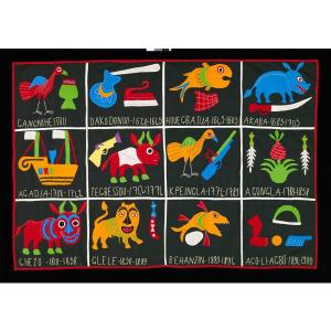
Point: "Wall Hanging" - Unknown (known to have come from the Fon Peoples in the late 20th Century

This cotton wall hanging comes from the Fon peoples of the Republic of Benin.  Their culture is known for their colorful banners that contain a narrative of some sort.  From a distance, one may not realize that all of these various images collectively form a storyline relative to the Fon peoples culture.  Up close, one can see that a narrative of some sort is prevalent within the points, something that can be lost when viewing from afar.

Line: "Femme Sérèr" - Moustapha Dimé, 1992

In African art, proportions of areas on a piece relates to its importance in society.  In this piece, we see a woman formed with the breasts and hip areas having a sharp contrast to the thinness of the body.  The breasts and hips (made of mortar, pestle, and wood bowls) are prevalent to represent healthy births and nurturing.  The piece gives us a glimpse into the expectations of women in African culture.
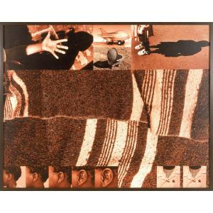
Form: "Open Letter to God" - Zwelethu Mthethwa, 2000

Mthethwa’s use of common colors and layering allows for this piece to appear to appear three dimensional, when it is really just two dimensional.  The darker brown and more textured pieces seem to jump out, while lighter shades of brown depicting scenes rest in the background.  Mthethwa’s goal in this piece was “to depict children as the silent, helpless witnesses to and victims of South Africa’s HIV/AIDS epidemic.”  Although one may not be able to infer that at first glance, the piece becomes stronger when you see how images are linked to this idea (such as the child standing in the shade, the hand reaching out, etc.)
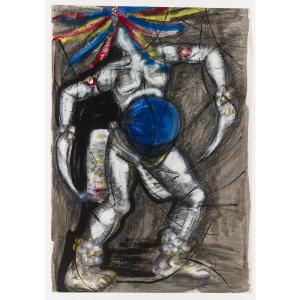
Movement: "Large study for 'Masquerader'" - Sokari Douglas Camp, 1981

This piece by Sokari Douglas Camp shows movement in two dimensional form.  The emphasis on the darker shading of certain areas (the thick, hard lines situated near the upper arms and across the legs) demonstrate the rapid movements of the dancer.  The dashes of color (most prevalent in the headdress) makes the viewer imagine the ferocity of the Masquerader’s movements.  This piece was a personal favorite.

Color and Color Psychology: "Hongera Barack Obama" - Unknown, 2008

In “Hongera Barack Obama”, we are bombarded by the color orange.  All of the orange shows unity within the piece.  “Hongera Barack Obama” translates to “Congratulations Barack Obama”.  The text on the piece, “Upendo Na Amani Ametujalia Mungu” translates to “God has blessed us with peace and love”.  These two sentences relate to the color psychology of orange, which is the color of “the friendly warmth of the heart fire.”

Color and Color Psychology: "Portrait of a Woman" - Ibrahima Sall, 1967

“Portrait of a Woman” uses the contrast of its vibrant yellow and deeper blue background to draw in the viewer.  Yellow represents optimism while blue represents spirituality and reserved elegance.  Together, they portray a strong and hopeful future for the strong women of Africa.  This piece immediately grabbed my attention and may have been my favorite at the museum.

Pattern: "Woman's Wrapper" - Unknown, known to come from the Yoruba peoples, mid 20th century

The complex pattern used on this cloth is known as “sun bebe”, or “lifting up the sun”.  The pattern is created by keeping the indigo dye from reaching certain areas of the cloth through painting or stenciling.  The name refers to beads brides-to-be wore when performing a private dance before their future husbands.

Texture: "Totem Pillar" - Lamidi Olonade Fakeye, 1972

This piece is completely hand carven and the intricacy is shown throughout.  Fakeye developed very rigid textured areas, especially with the middle block, and the well-carved bodies.  As with many pieces of African Art, the proportions are very important.  The large breasts on the top figure represent fertility, while the large heads of the figures represent wisdom.

Balance: "Ka Cabala Voodoo" - Ouattara Watts, 1995

The balance of “Ka Cabala Voodoo” promotes a tranquil and religious feeling throughout.  The two clay mounds at the top represent the mosques of West Africa and the the clay-esque surface represent various altars where one would make offerings.  This piece is an example of approximate symmetry, as not all pieces are identical but they are similar.
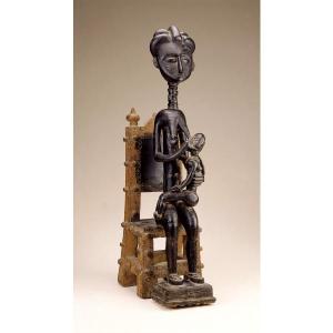
Proportion: "Female figure with child" - Unknown, from Asante peoples, Late 19th to-mid 20th century

As mentioned earlier, proportion plays a large part in African Art.  The proportion of a certain part in a figure shows its importance in culture and religion.  In this piece, the large chair shows that the female had power in society (her long neck and tall figure also assert this).  In a sense, it shows how she stands over others as a ruler.  The large breasts represent fertility and the large head shows wisdom.  The child breastfeeding shows a passing on of this wisdom and hope for a healthy future.

Rhythm: "Glance toward the Unknown" - Fathi Hassan, 1985

In “Glance toward the Unknown”, the rhythm of the scripture that forms the face brings intimacy and movement to the piece.  We see the connection of man and written word, the scripture is seamlessly in rhythm with the human face.  The writings are illegible though, showing that there is still an unknown distance between man and true religious connection.  This was another personal favorite.

Emphasis: "Sheikh Amadou Bamba" - Gora Mbengue, Late 20th Century

The figure at the center of the painting is emphasized due to his vibrant white clothing.  This man is Sheikh Amadou Bamba, who is a Sufi saint.  The brightness of clothing compared to the rest of the painting emphasizes his figure more than any other.  The neutral background allows the prominence of this holy figure to shine through.
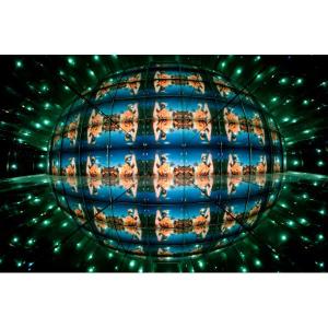
Unity: "Brave New World II" - Theo Eshetu, 1999

When you look straight on at “Brave New World II”, you can see four mirrors reflecting the image of a movie out to the viewer.  As one continues to stare at the image, the lines of the mirrors disappear and form one cohesive and unified image.  When one looks from a side view, a whole new perspective is shown.  We see the mirrors reflecting off one another and creating something similar to a combination of a kaleidoscope and a disco ball.  It is quite a breathtaking and visually stunning piece.  Along with “Portrait of a Woman” by Ibrahima Sall, this shared the position of being my favorite piece.

Diesel Clothing’s “Be Stupid” campaign

Diesel Clothing’s “Be Stupid’ advertisement campaign is causing quite a bit of controversy can be found in print, online, or on billboards.  This specific AD contains a light red block font reading “SMART LISTENS TO THE HEAD.  STUPID LISTENS TO THE HEART.” over an image of two young persons (one male, one female) kissing as they hand out of moving cars.

I noticed the vibrant red jacket of the young woman leaning out of the car, then I noticed the kiss, which lead me to read the text.  The color of the jacket gives it prominence.  The red jacket and the kiss use the design element of point.  Our eyes are drawn to it due to the vibrant colors and the connotations evoked by the images.

In color psychology, red evokes feeling of passion, energy, and other erotic images.  The movement of the cars in the image along with the kiss reflects the myth of rebellion and daring within the viewer.  We think of being a teenager revolting against social norms and culture.  The AD wants the viewer to associate Diesel Clothing with daring and youth.  The woman is also leaning out of a car with a European license plate which lends to the myth that Europeans are passionate lovers.

The “SMART LISTENS TO THE HEAD.  STUPID LISTENS TO THE HEART” text  is effectively placed in the unequal spaces of the photo.  Every space is properly used and draws attention.  The text makes me want to take risks in the world, and now I associate taking risks with Diesel Clothing.  I do not personally believe we should strive to be stupid, but these advertisements are creating controversy which is just more advertising for them.

Overall, the AD is well designed and uses multiple Elements and Principle of Design.  The AD plays on the myth and connotations of teenage rebellion and lust, which correlates to the psychology of the color red.  The advertisement effectively creates controversy and draws a strong reaction from its viewers.  It isn’t forgotten by its viewers, thus it is a strong advertisement.

Paa Joe’s Elephant Fantasy Coffin

Paa Joe is Ghanaian artist who works meticulously on his hand carved fantasy coffins.  His elephant coffin uses soft and warm shades of browns.  The size of the coffin is realistic, it could easily house an actual human body.  The golden backdrop and lighting of the exhibit also nicely contrasted with piece, adding warmth and drawing your attention to the coffin.

The elephant’s body maintains a solid repetition of vertical black lines and white circles within those lines.  The coffin falls into most of the criteria listed in “The Visual Language of African Art”.  The object clearly has a function, as it has the ability to house and honor a dead body.  The craftmanship of the piece is highly valued as it is completely hand carved.  Visibility of line and form is clearly portrayed with its strong edges and smoothly polished body.  Realistically, the head of the elephant could be larger, but for the emotional proportion the body is clearly the focus (as it houses the human).

Most African works of art follow the rule that persons should on be depicted in the prime of their life, that’s why I believe the coffin is meant to show liveliness even in death.  Security and safety is another factor in African art, the coffin offers two forms of protections.  First, there is the obvious in that the coffin is meant to hold a body.  The second is the elephant, in that an elephant is a massive creature in the real world and could offer protection in a spiritual realm as well.

The craftmanship in the piece is immaculate and it introduced me to the art of fantasy coffins.  It is quite original, at least to me as I had never seen one before.  The colors are well done and fit the elephant very nicely.  Most importantly, I believe it properly represents the artist’s homeland.  If someone was to ask me where the piece originated, my first guess would be Africa.  Would I buy this work?  I doubt it.  As much as I love it, I doubt I’d have anywhere to properly showcase and show respect to the art.  If there was an area though, I would immediately buy the piece.  The piece is great to analyze for the liveliness of the elephant and that it is also meant to harbor the dead.